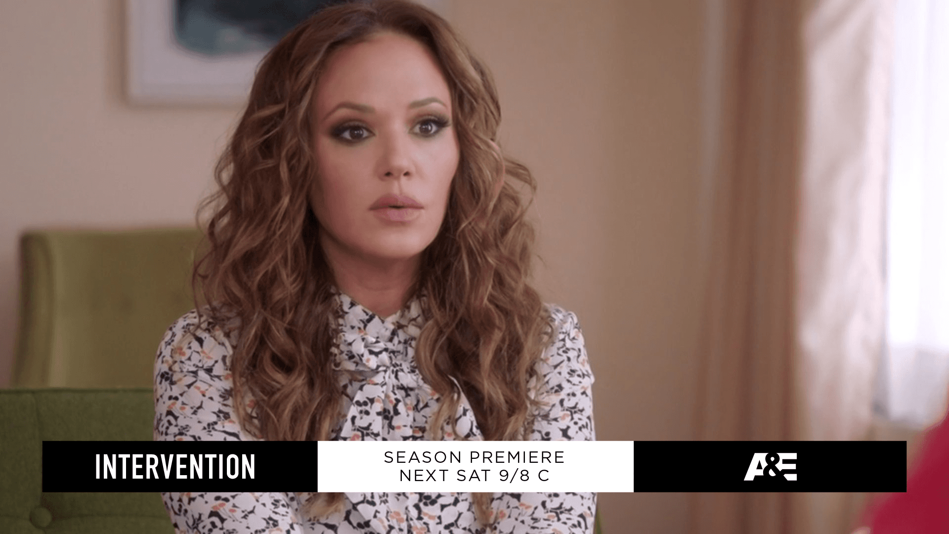
After years of collaborating with A&E, we were tapped to bring consistency to their brand system. The goal was to create a playbook that would make it easy for in-house designers to deliver cohesive graphics across hit shows like Intervention, The First 48, and Storage Wars.
The ask was threefold: audit, articulate, and design.
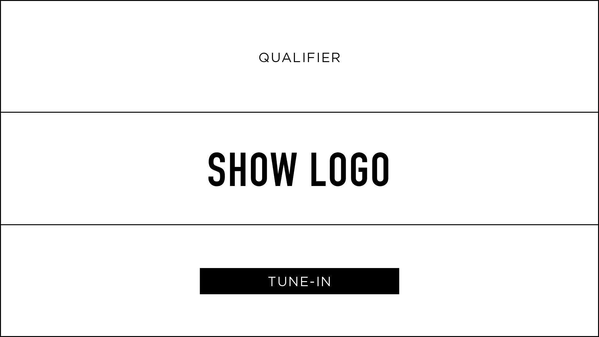
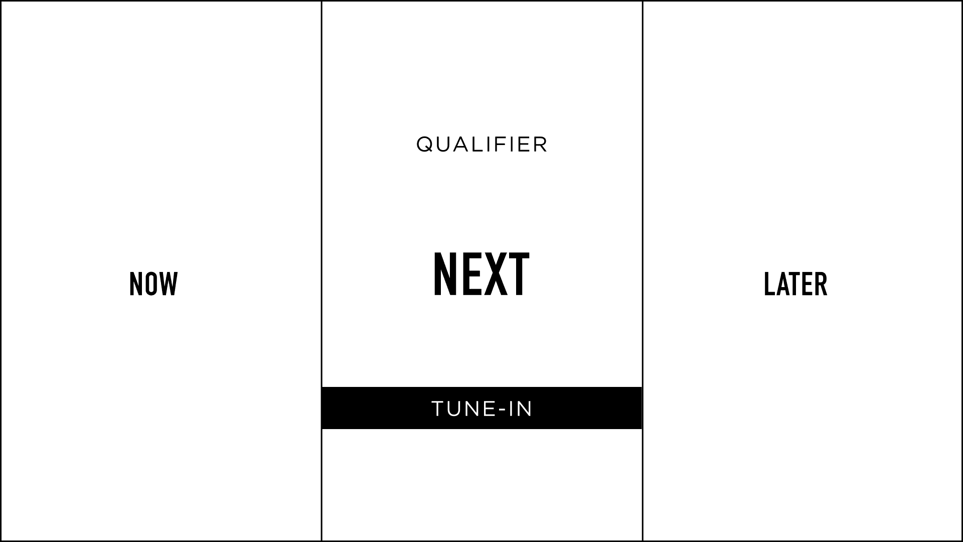
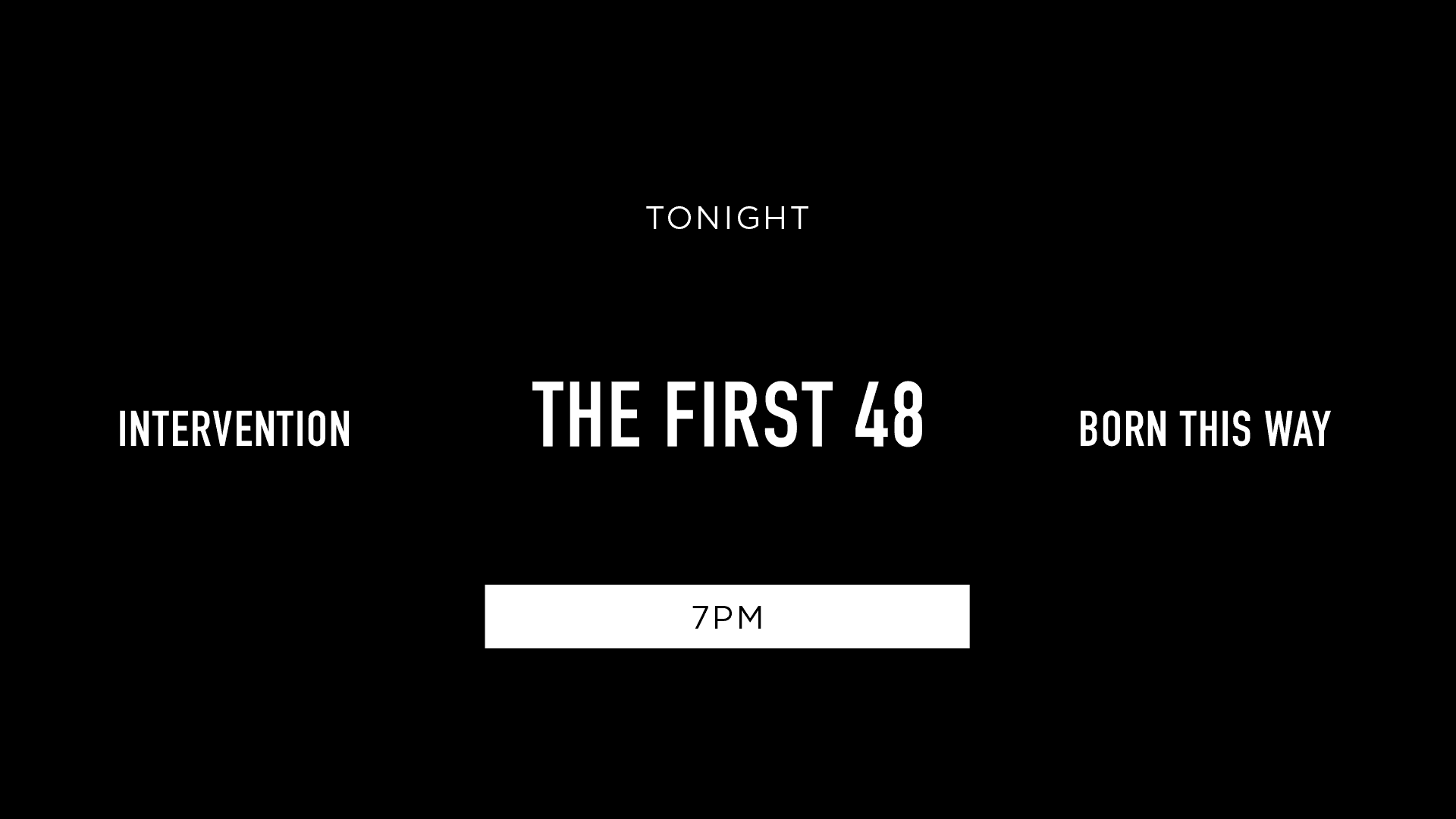
We found a pattern that would ultimately become the framework for our system building: the Rule of Three. A&E approaches programming through a people-focused lens. The system needed these personal stories (not the design) to be the focus and The Rule of Three allows for ample space for them to be seen.
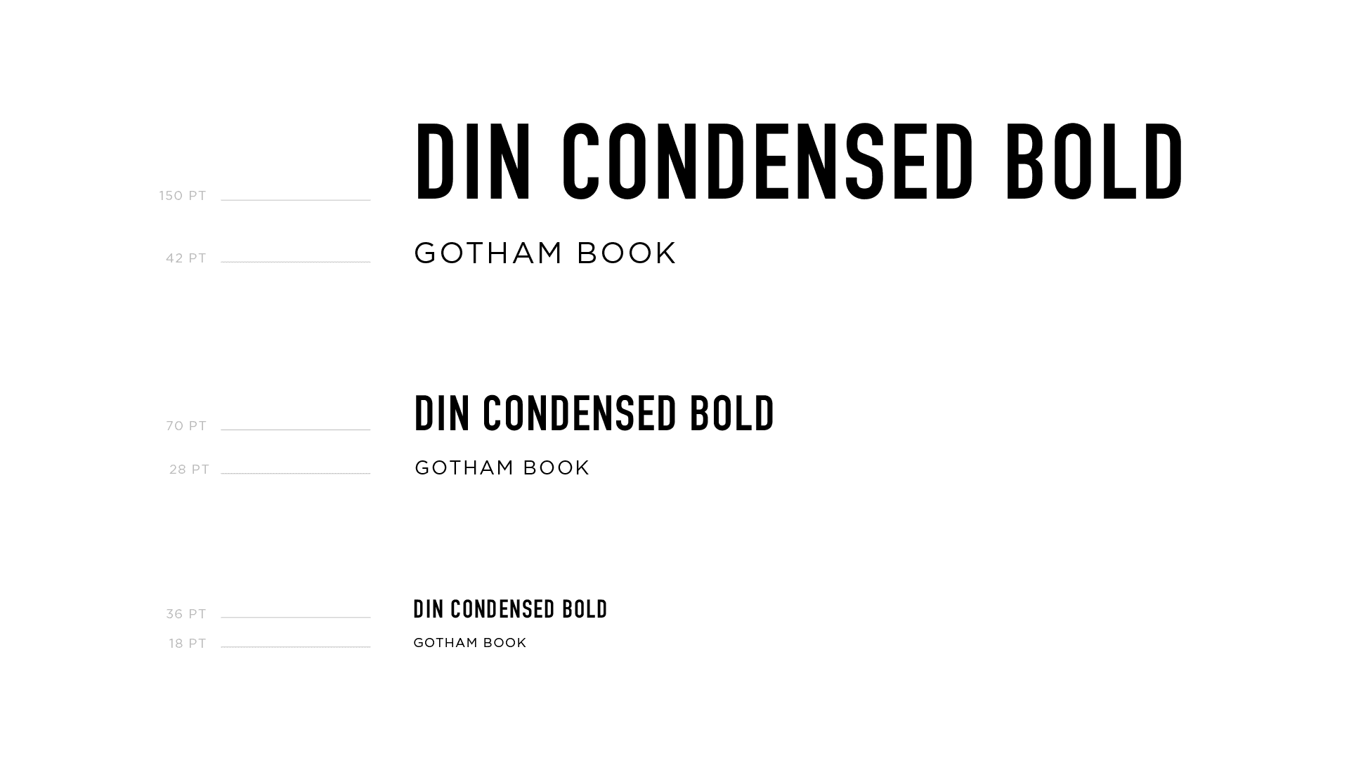
Now on the flip side, on-air typography and design systems needed maximum visibility and impact. One of the fonts we settled on was DIN which originated as a standard for traffic signs, street signs, house numbers, and license plates. If you could read a sign while sitting in your car, you could definitely read the title while sitting on your couch.
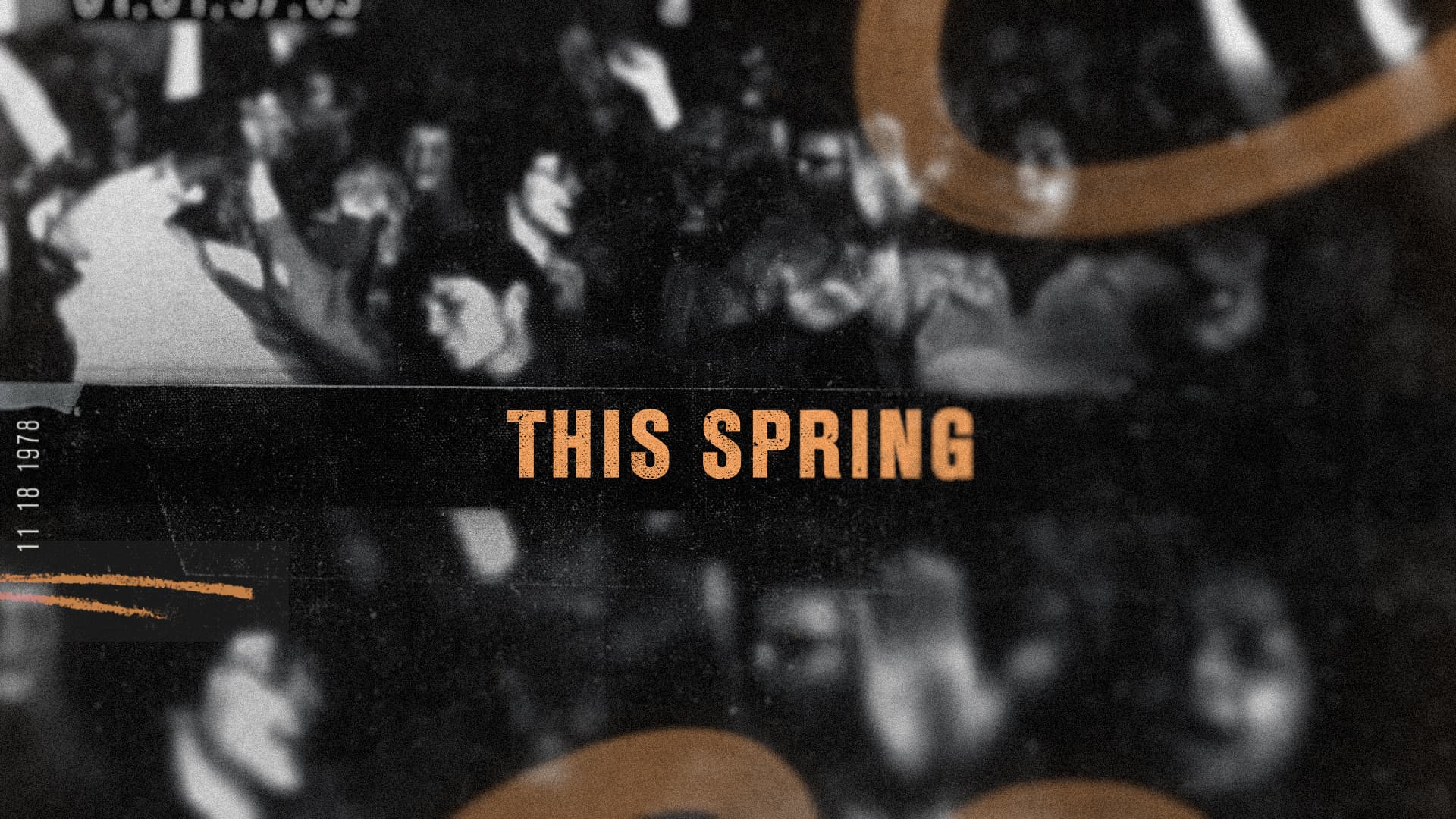
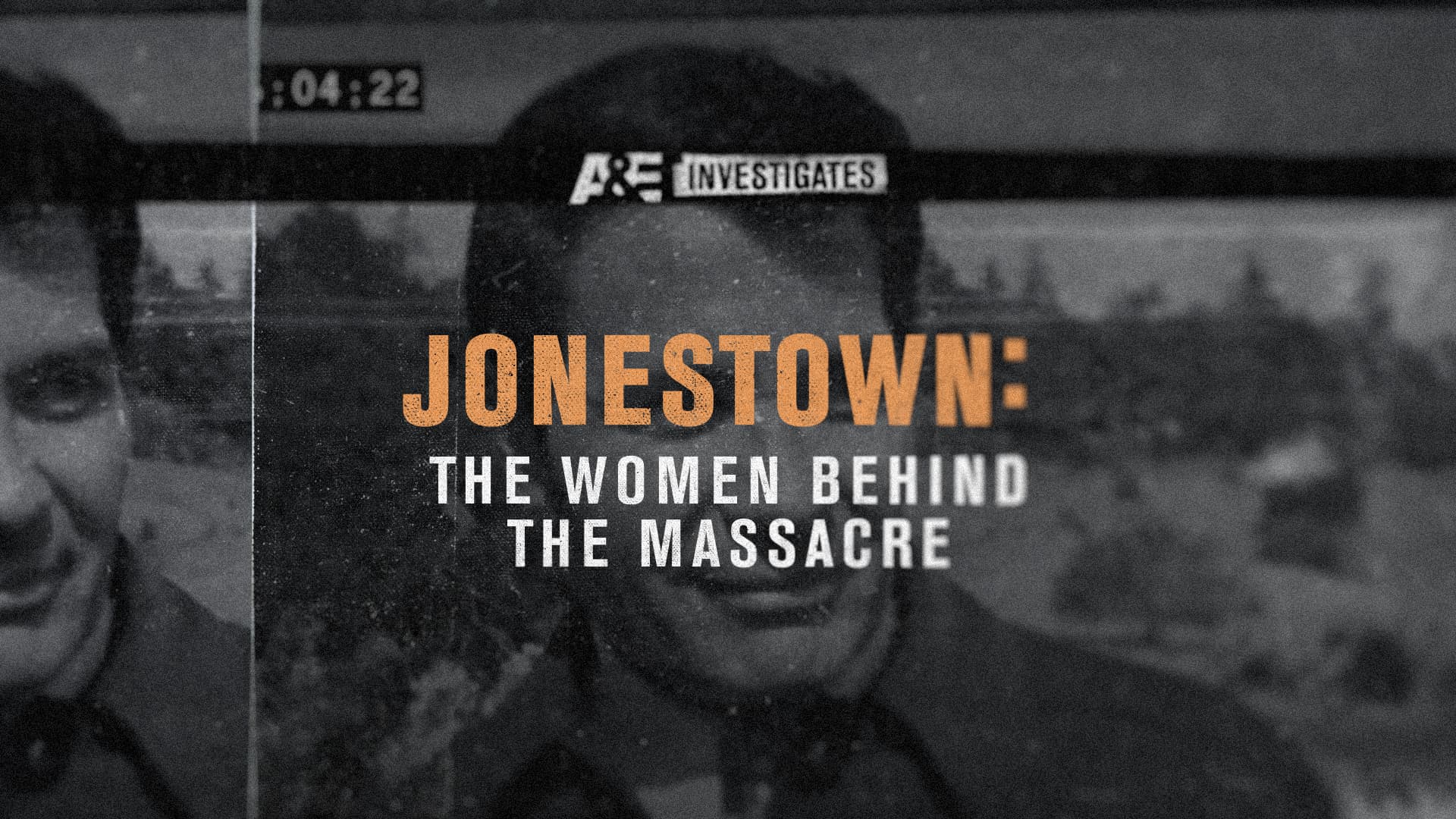
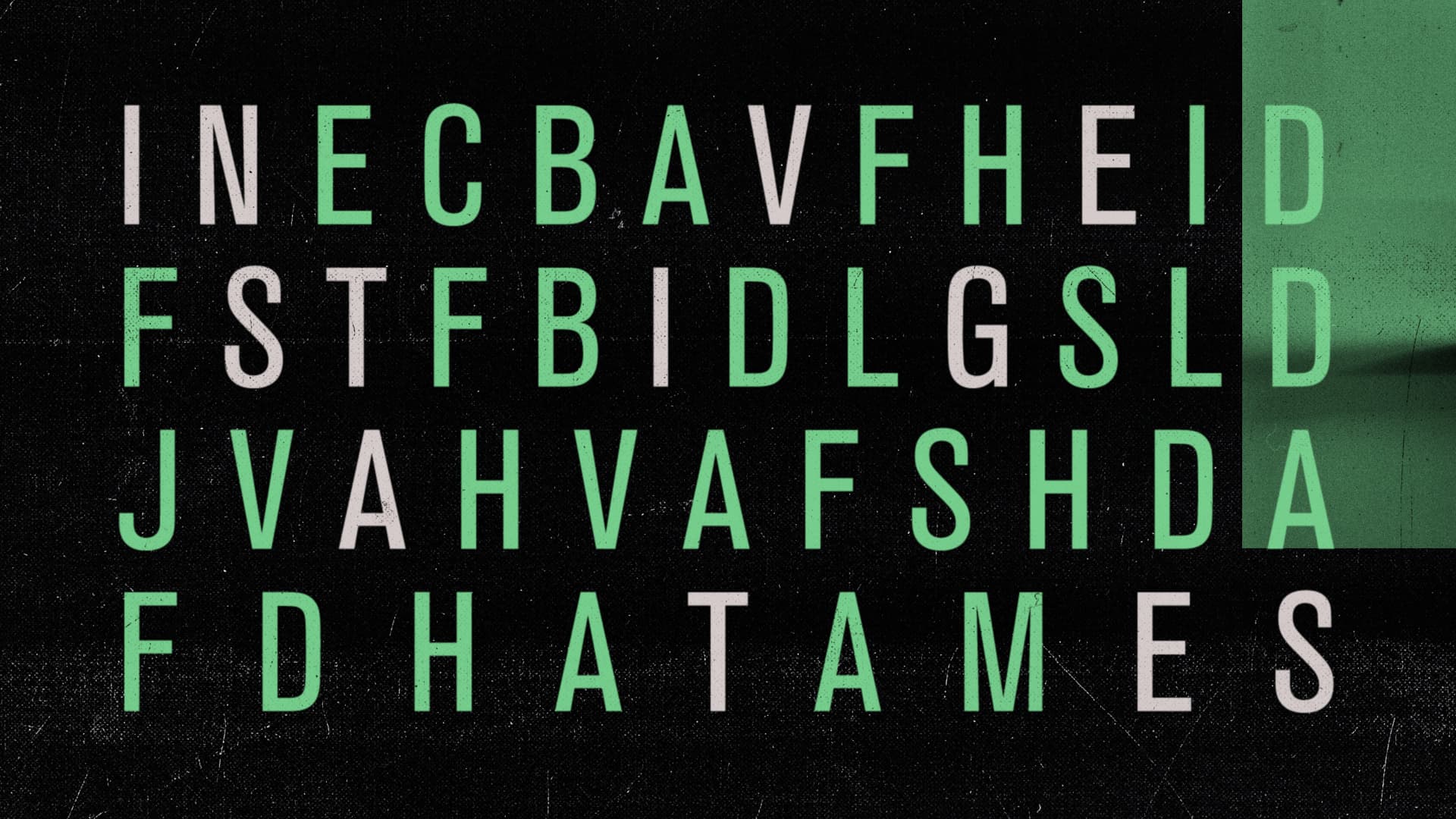
Ultimately, it was important to root each decision in a design tenet that would unify A&E’s vocabulary and create their unique design language. The playbook outlines not only general principles of the brand, but also shepherds designers through choosing color, texture, and other elements.
Rescue Vessel
A&E
