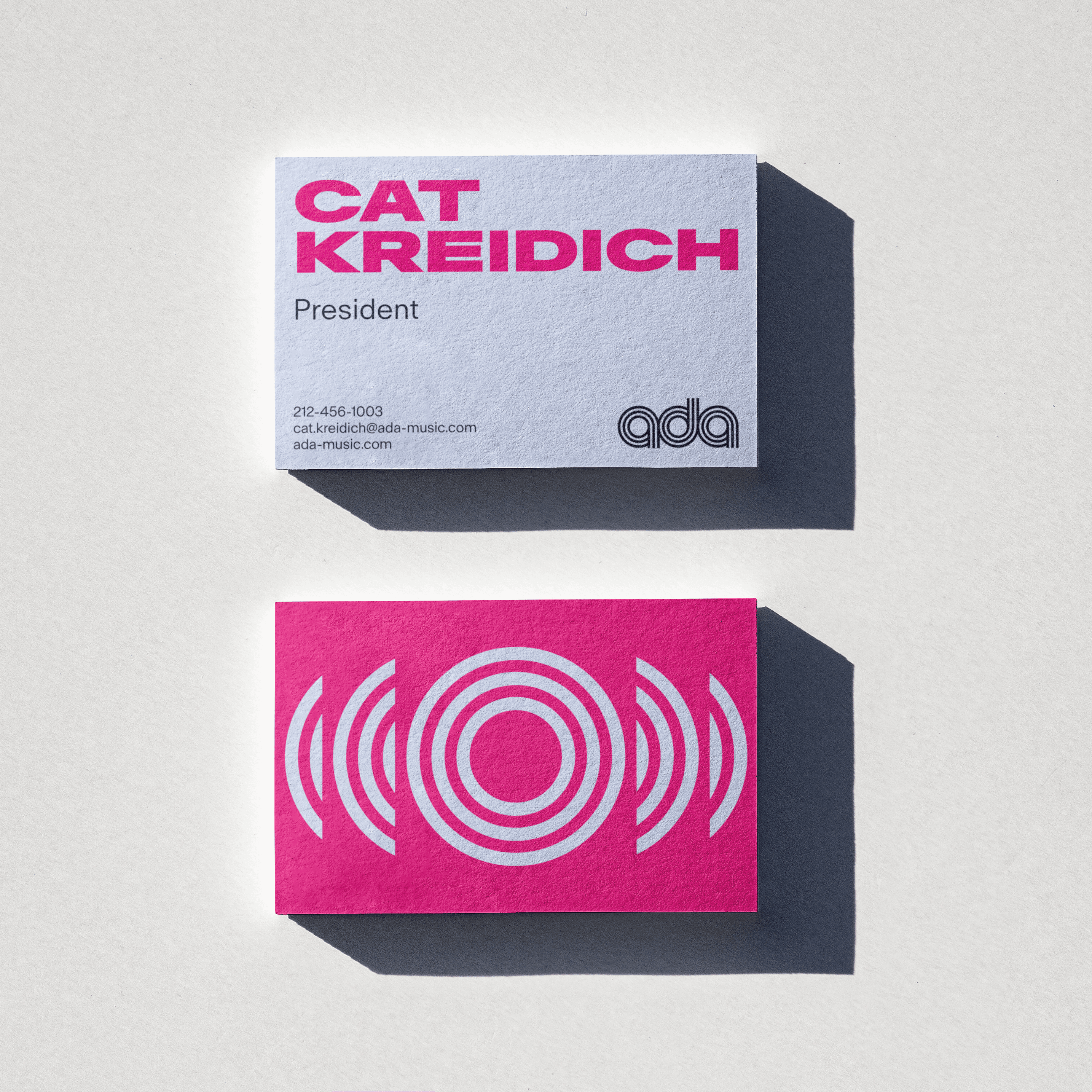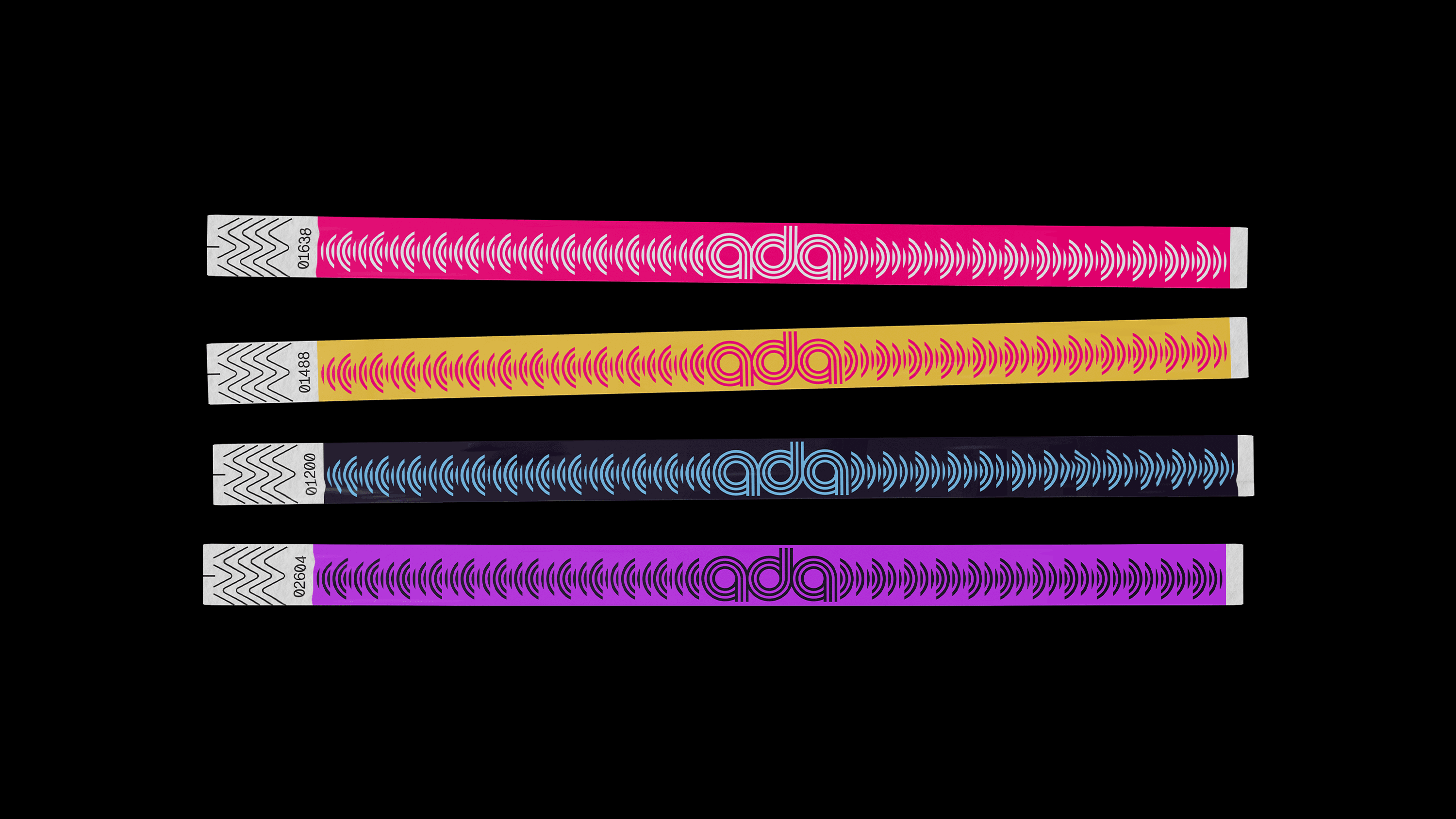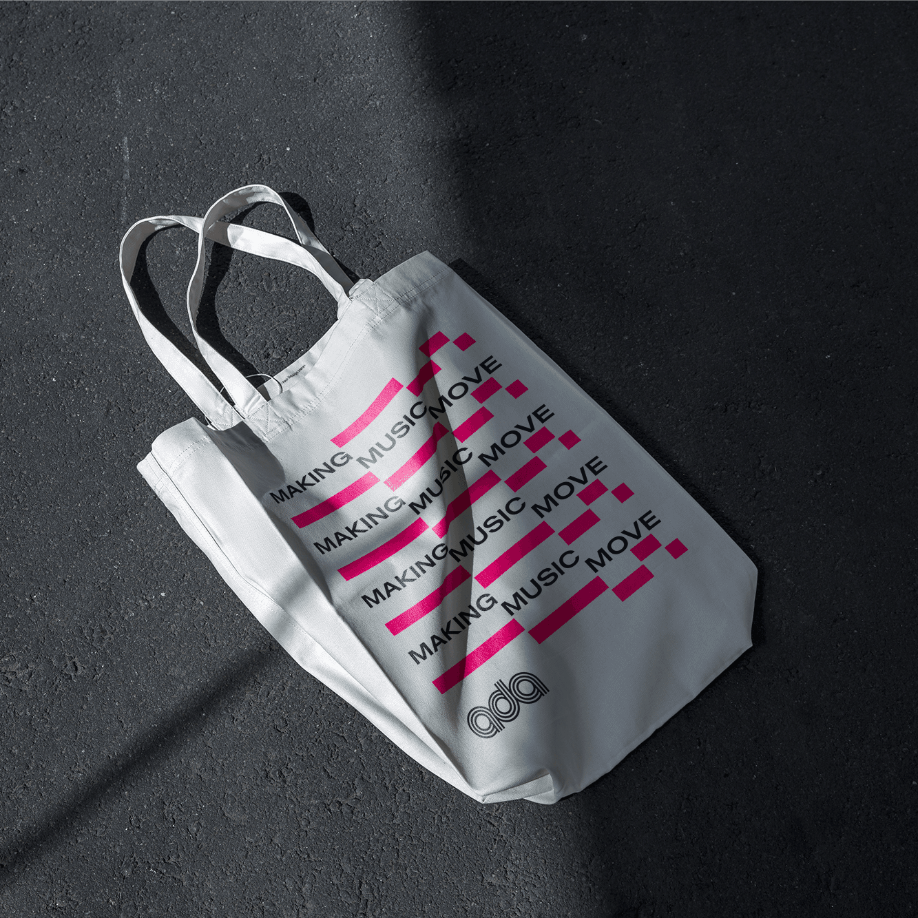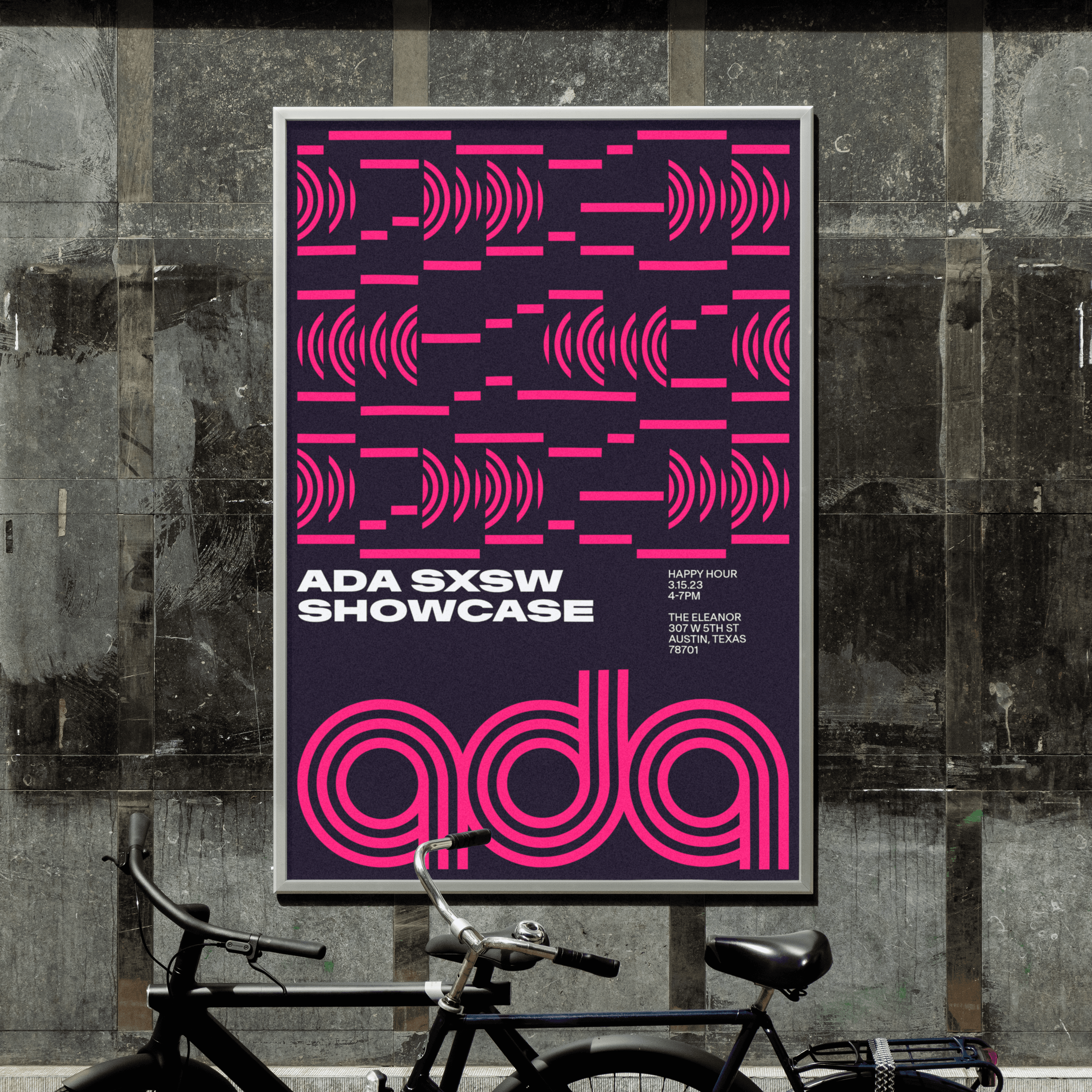
More than ever, music travels — crossing boundaries of geography, genre, and context. For 30 years, ADA has been building the pathways, technology, and relationships to make that possible. At their core their team is filled with passionate music fans. As they approached this milestone, they came to us to create a brand that reflects the direction they see for the next 30 years.
While material changes to the logo weren’t possible because of the trademark process, it was in dire need of a rebuild. It quietly held some wonkiness and its scalability could be improved. Beyond that, let’s be honest — it was already a damn good logo for a record distribution company.
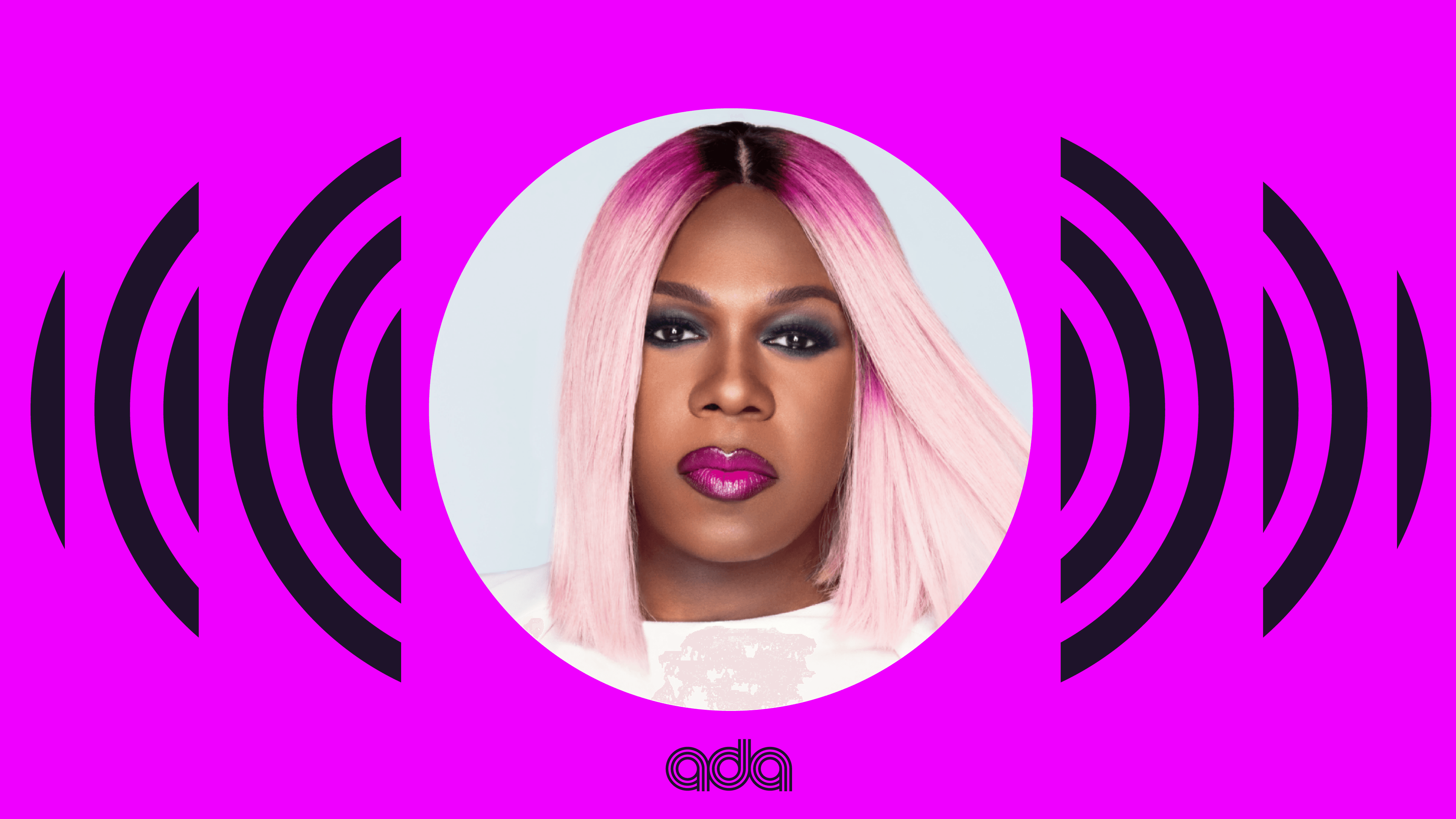
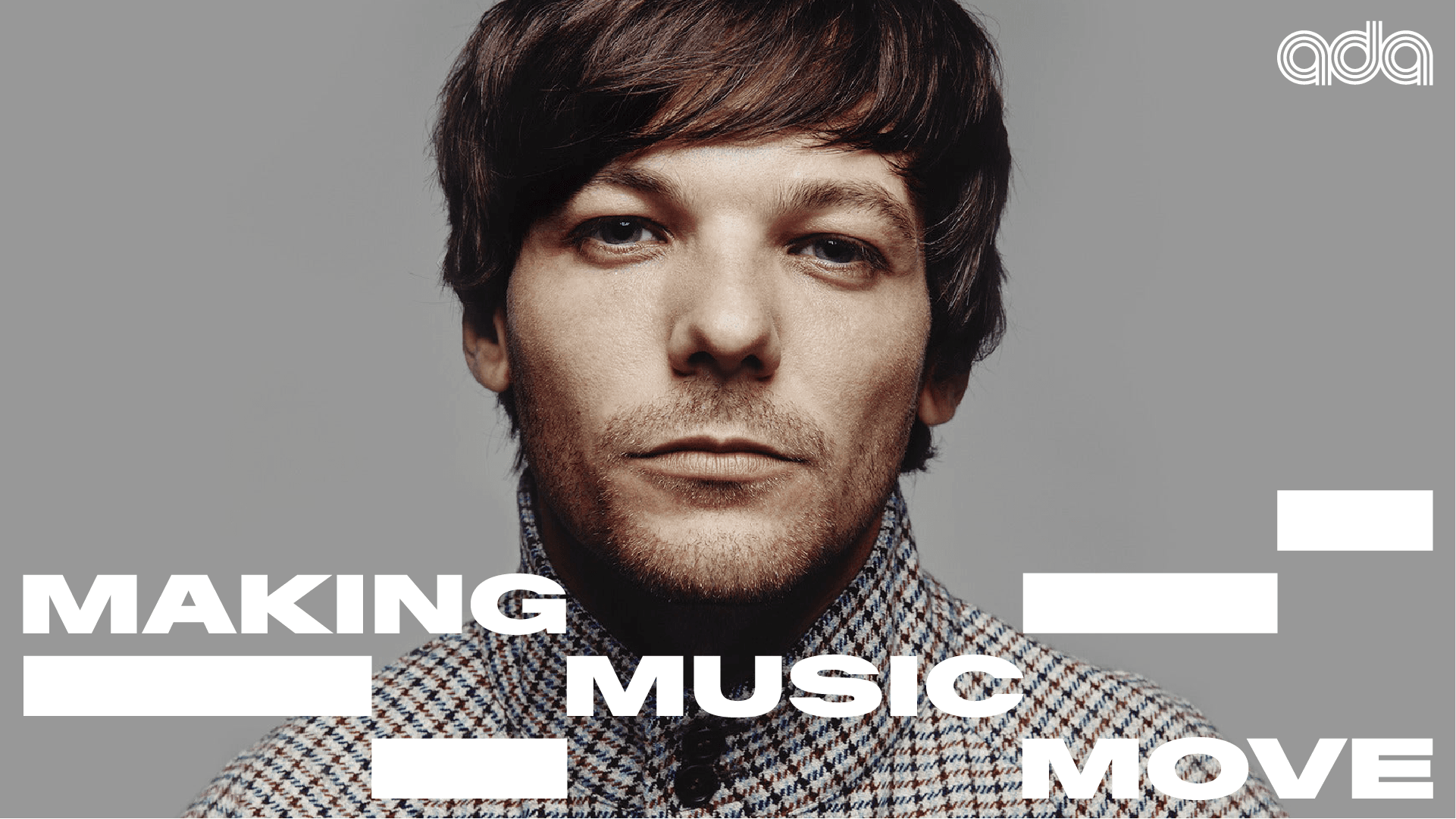
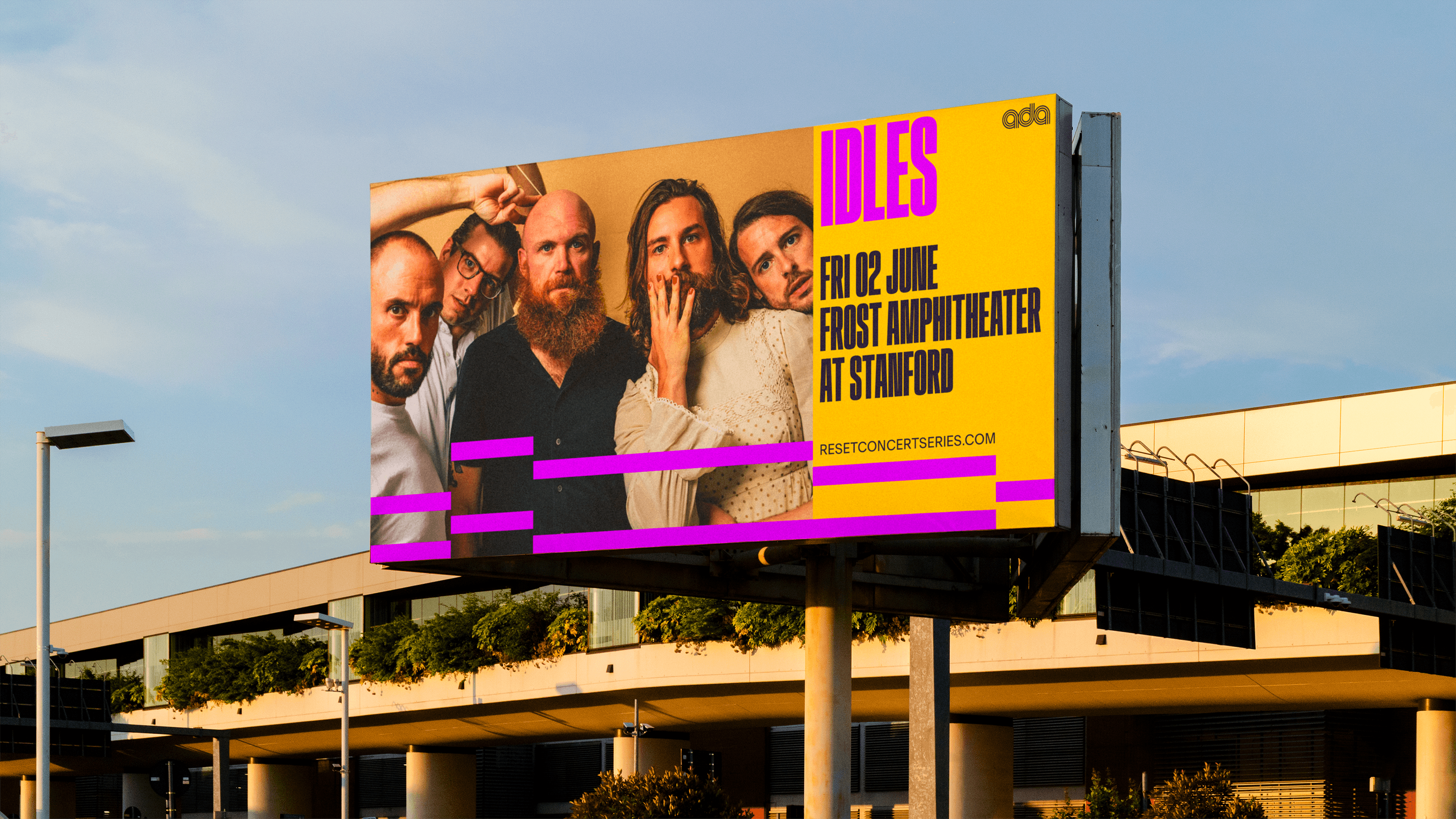
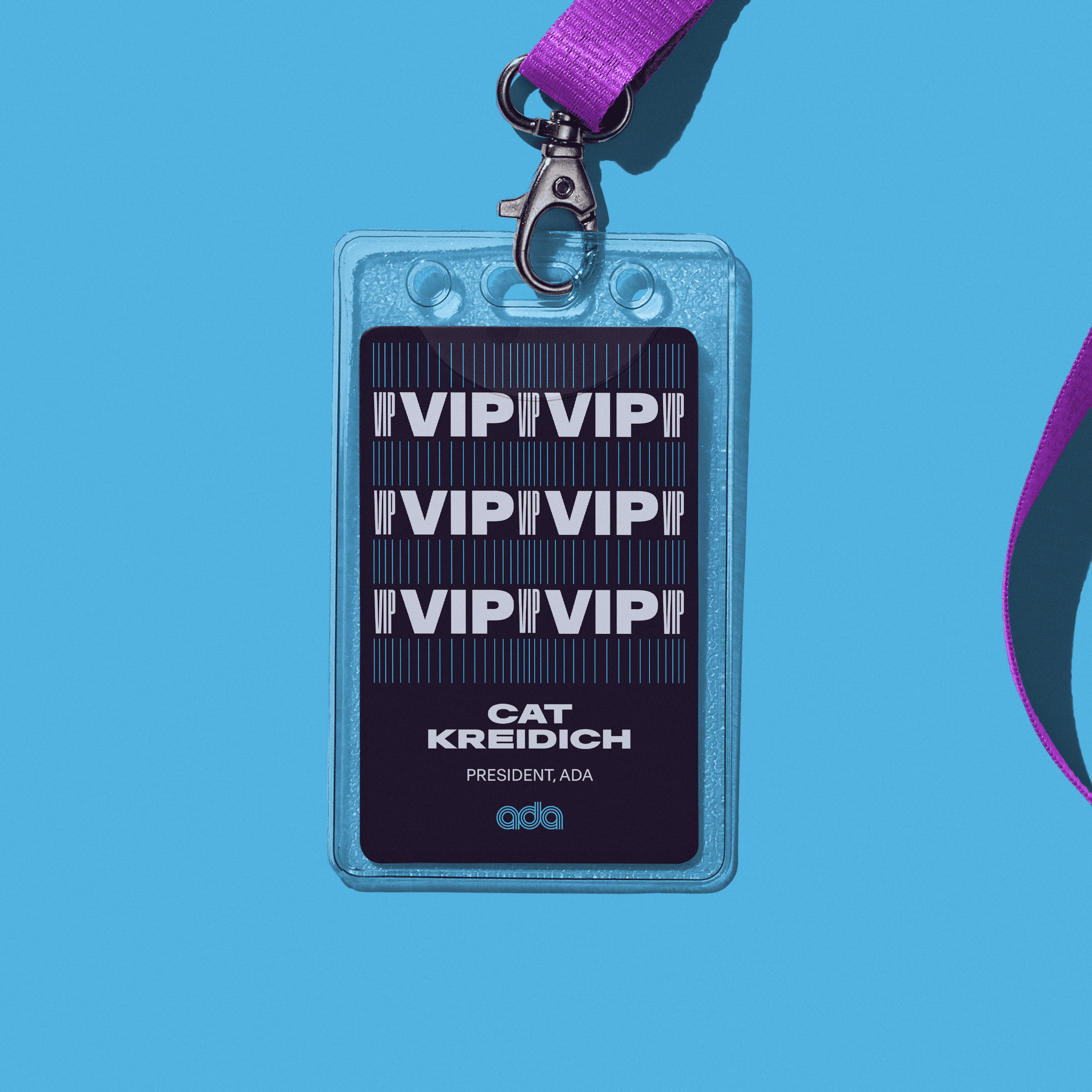
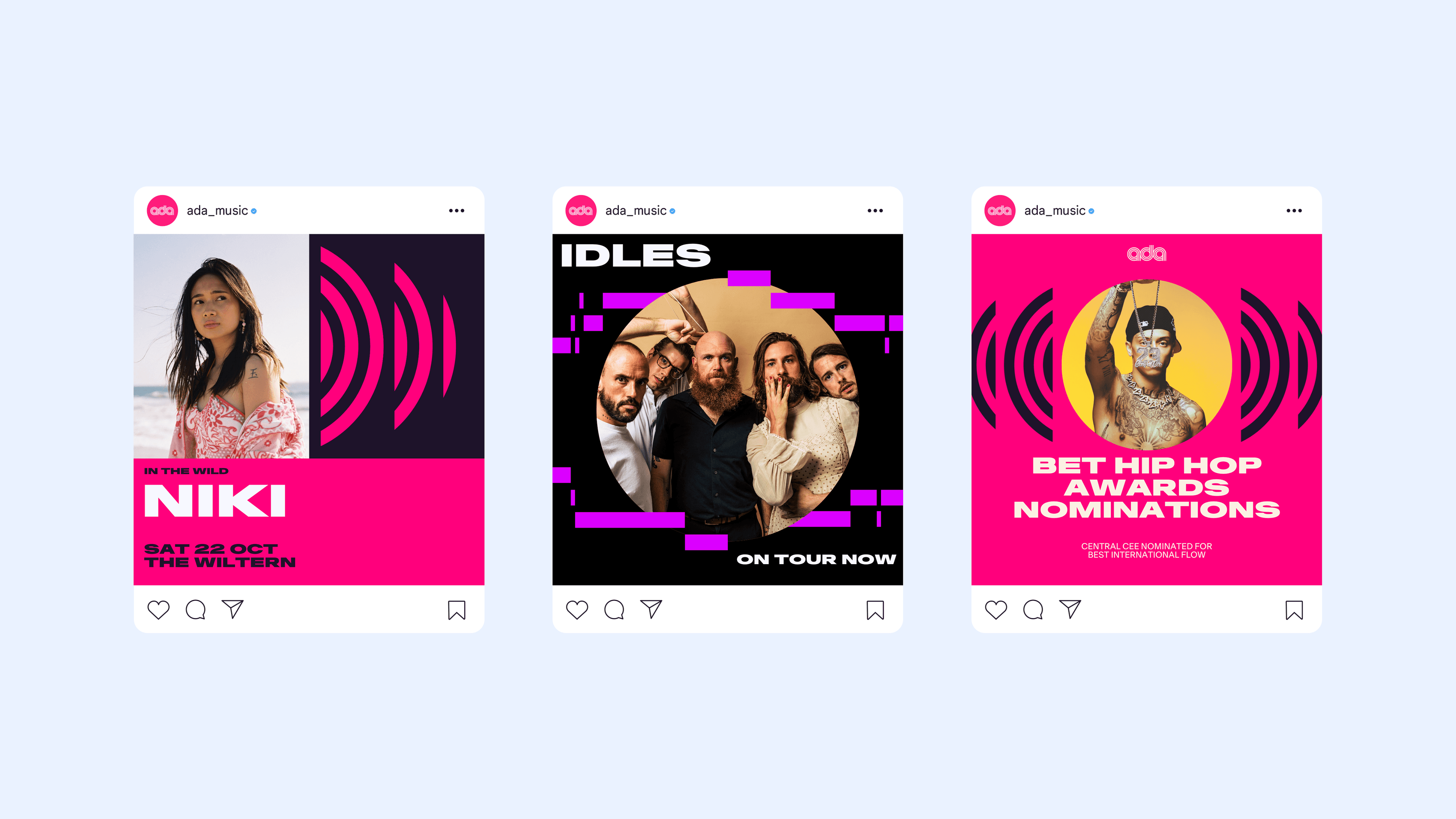
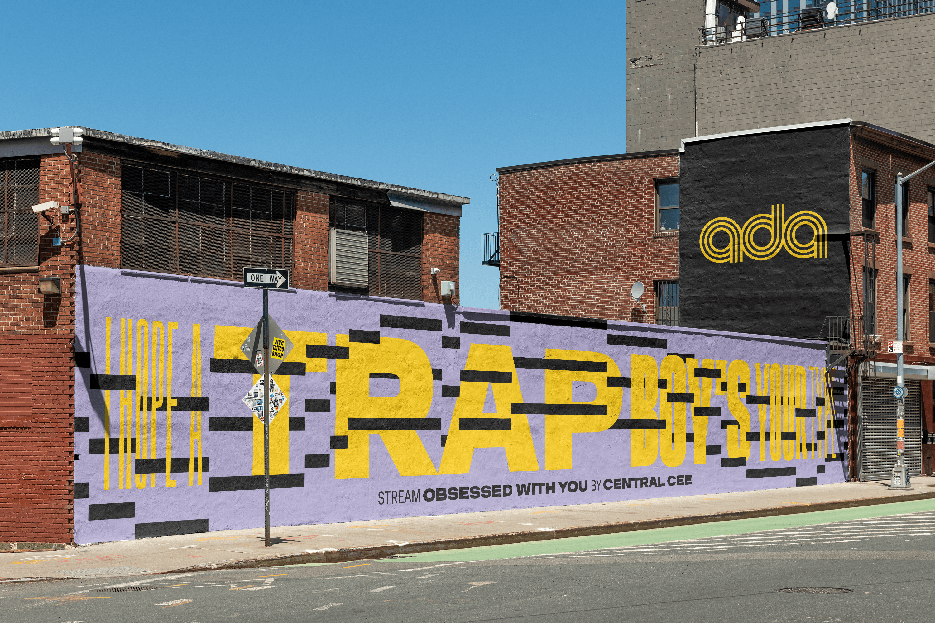
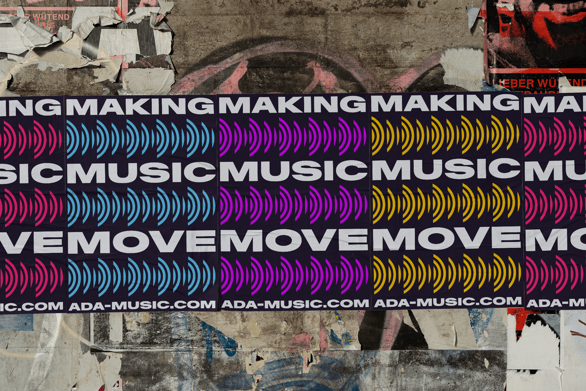
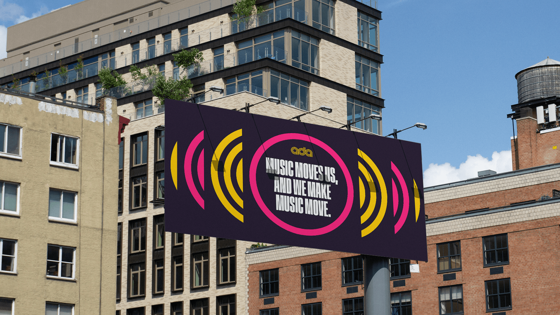
The brand direction was centered around the line “music moves us, and we make music move” — which captures both their passion and the fact that they get shit done. Having a deep love and connection to music ourselves, we didn’t have to look far for points of reference. Everywhere we looked from input levels to recording software to speaker diagrams and everywhere in-between — music is already a highly visual space. Bright colors and bold typography have been synonymous with concert posters for nearly 100 years, which also became a central point of the new visual identity.
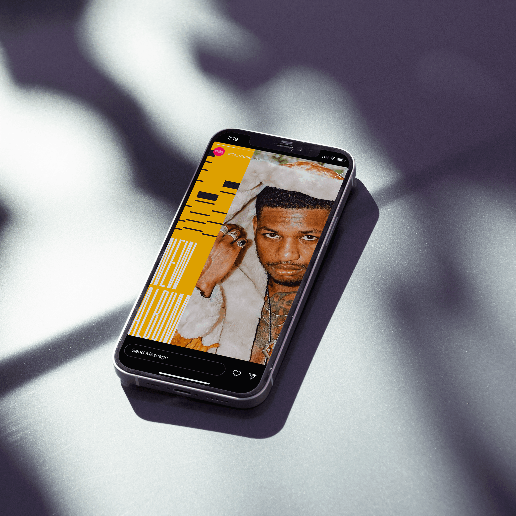
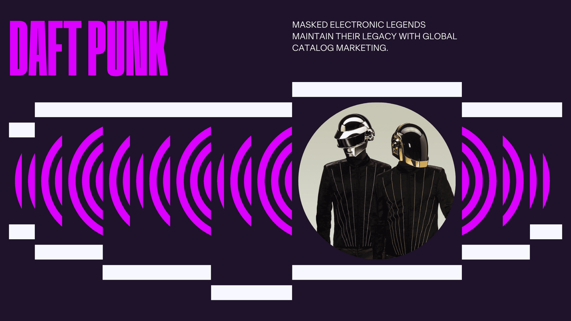
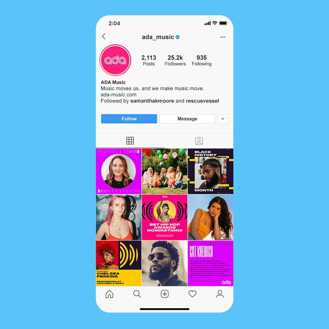
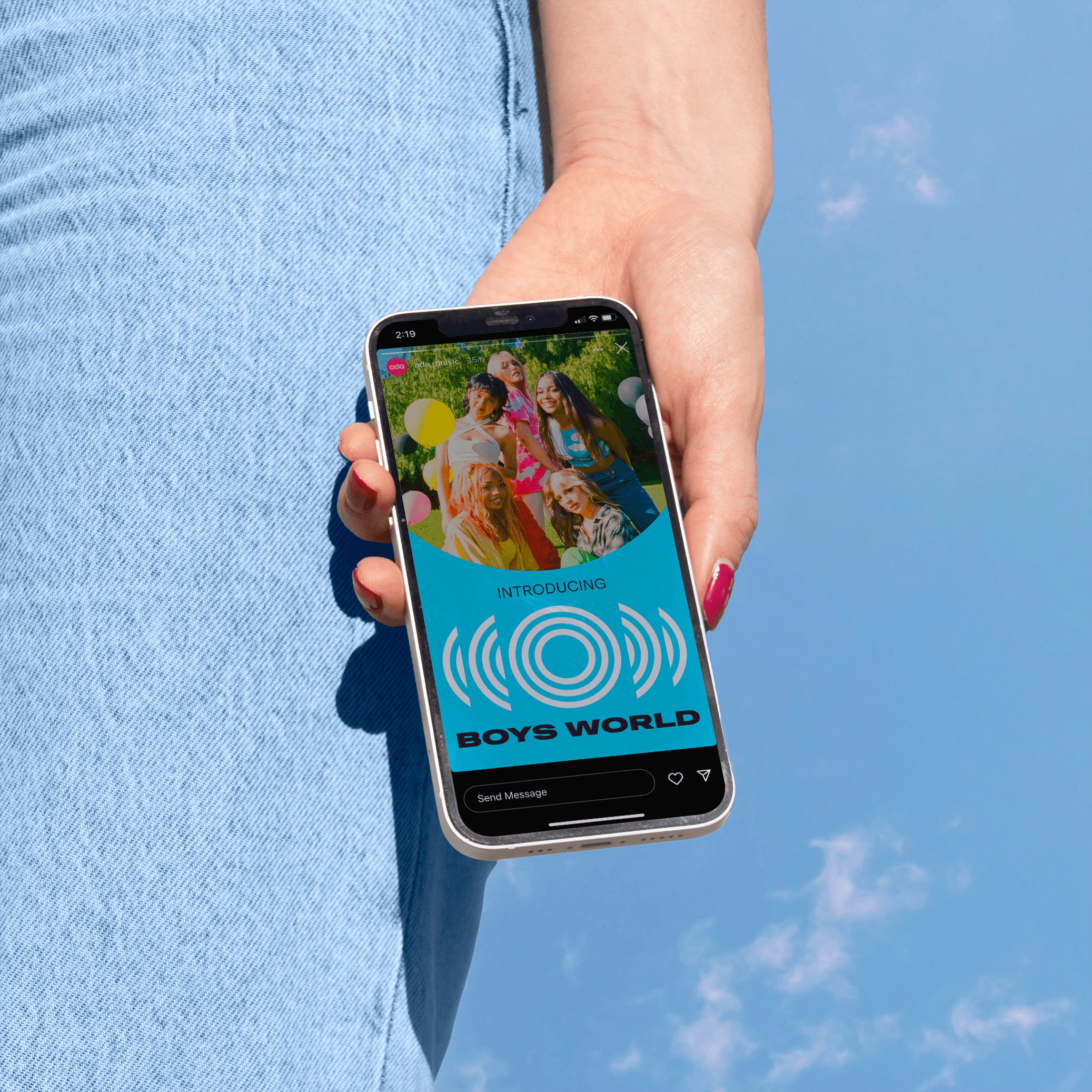
We built the graphic system from deconstructed shapes found within the logo itself. These pieces were stretched, repeated, and expanded in a hundred different ways to form the new system. The look and feel, both in static execution and in motion, are meant to feel musical. There’s rhythm. There’s life. The new ADA really is Making Music Move.
Rescue Vessel
Brand Strategy
ADA

